Creating a Network Graph
Previous Post: Data Processing with NLTK
From the ccp_people.csv file, we built a simple social network using Gephi. This was originally a undirected graph where each edge represented a connection that two people were in the same document. We first calculated all possible pairs within each document, and then all pairs between documents, and rendered them in Gephi. The graph ended up being too large to render, given that there were more than 18,000 pairs. We initially built the network from pairs because our initial research questions focused on the relationships between individuals, rather than the relationships represented by the meetings. But combining pairs quickly became impractical because we also needed to calculate all possible trios, quartets, etc. We had to find another way to create a connected graph without generating n-groups at a time.
We did some research and found Jerome Kunegis’s Handbook of Network Analysis, which provides 20+ categories for types of networks. His definition of “affiliation networks,” which “denote the membership of actors in groups,” seemed the most relevant to the CCP corpus. These networks are usually represented by bipartite graphs, in which two types of nodes are connected. In our case, we have “document” nodes and “people” nodes, and the graph shows which people are connected to which documents (conventions). This network also recognized that the same people can belong to different conventions, making the graph connected.
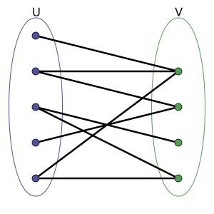
A simple bipartite graph, where nodes belong to two different sets u and v
Then, I created the bipartite graph through ccp_adjancency_list.csv, where each row stated the document filename, and then the list of people tagged in that document. The Python script can be found here.
We imported this CSV into Gephi as an adjacency list. We used an additional plugin to color the nodes in the graph and we had the graph displayed. We experimented with the timeline feature to see how the graph changed over the years recorded. In Gephi, I filtered out all nodes with only one degree and enabled the timeline. In the graph, different document nodes (green) “popped” up at different connections, while some remain connected to similar people nodes (pink) over time with newer groups. While it was useful to visualize which people were connected to which documents, none of the centrality nor modularity measures were revealed in this way.
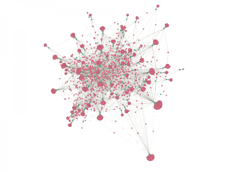
the bipartite graph of the CCP dataset, much larger with some “broccoli head” branches
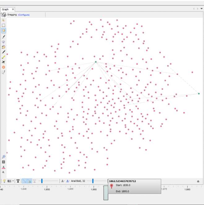
The dynamic timeline embedded into the graph
When analyzing our graphs with Gephi, we identified several features that we thought merited additional exploration. The first was “Modularity,” found under the “Statistics” window, which employs a common community-detection algorithm called the Louvain algorithm in order to measure the strength, or “modularity,” of the subgroups, or “communities,” within a larger network. These subgroups have nodes that share more connections with each other than with other nodes in the network, and have sparse connections to nodes outside of the group. The algorithm then uses this measure to find these groups throughout the network.
In the case of the CCP Corpus, the communities seemed to be grouped by geographic region (the location of the meeting was specified in the filename of the document) with several overlapping meetings appearing as the same community because they were geographically close together. This makes sense, but it was reassuring to see the algorithm detect these communities, given that we did not have any information other than each filename, which included the location and date of the meeting, and participants’ NER-tagged names.
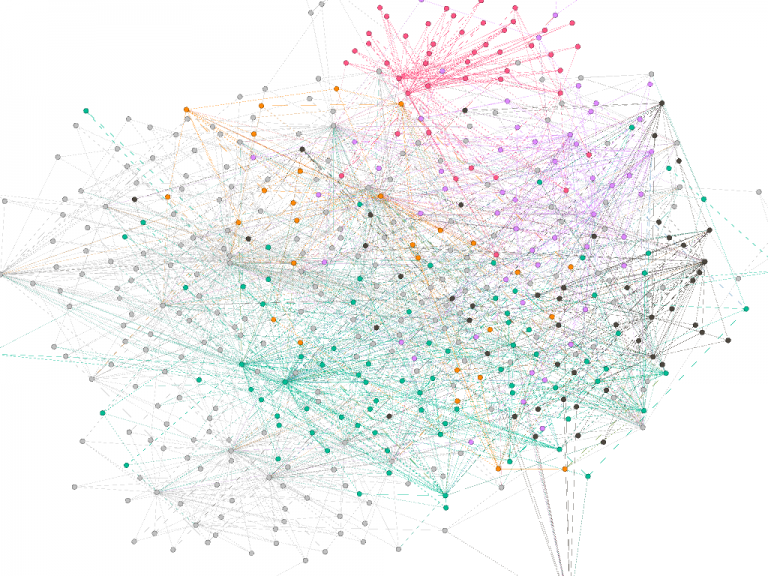
Pink represents people and conferences from North Carolina, while green represents most Northeast conferences and people in NY and PA
Another set of features were the centrality measures betweenness and closeness. On Gephi’s Average Path Length, it returns both measures automatically. We found that the nodes with the highest betweenness centralities are meetings nodes, which is not surprising. Throughout the graph, most of the people and meeting nodes had strong values of closeness centralities, which was probably the reason why Gephi’s Modularity function worked so well in finding the eight communities throughout the graph.
Knowing both detected communities and centrality measures did not help us complete the picture of how the network evolved, however. For example, did a higher betweenness centrality mean that the person was connected to more regions? Or did it simply mean that the person knew more people within that region? How could we measure that person’s influence if they traveled across regions? We’ll start to dive in on more of these questions in our next post, Exploring Network Models.
To interact with our graph in Gephi, check out our GitHub folder. The README describes how to download the plugin, observe the graph, and interact with its timeline like the gif above! Also, I’d love to hear your thoughts in the comments down below.
Next Post: Exploring Network Models