Data by Design: Static Visualizations for Playfair’s Chapter
Besides the “Export and Import to and from all North-America” scrollytelling visualization, I also created several static visualizations using d3 to showcase Playfair’s method with modern technologies.
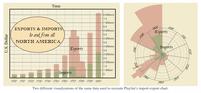
The first two visualizations use the same data of Playfair’s import-export chart.
The stacked bar graph on the left uses a similar axis and labels as the import-export chart. I have each bar with constant width representing each year we have in the CSV and positioned chronologically. For year 1770 to year 1782, where we have detailed data points, the bars are overlapping each other.
The Coxcomb graph on the right uses a circular axis, where each sector represents a decade. The width (inner angle of the sector) depends on the duration of time each data point represents, so from year 1770 to year 1782, the sectors are thinner than the others. I also made the choice to have the sectors outflow the circular axis instead of using a larger scale because I believe this dramatic visualization will attract readers’ attention to the later decades of the chart and emphasize its visual effect.
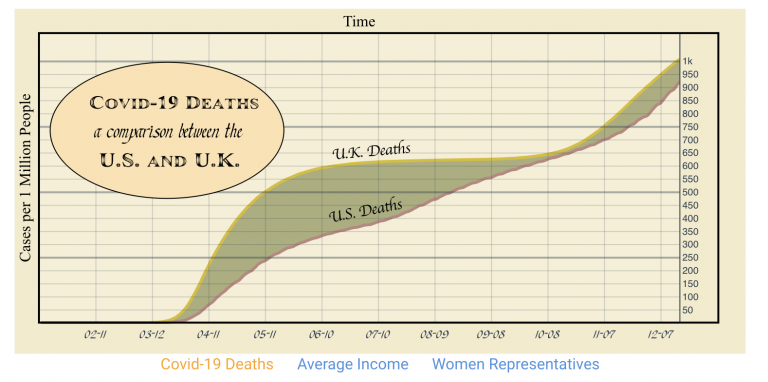
Covid-19 Death Comparison
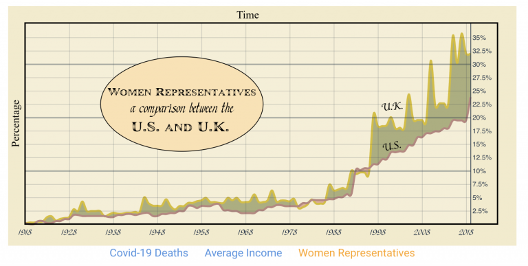
Women Representatives Comparison
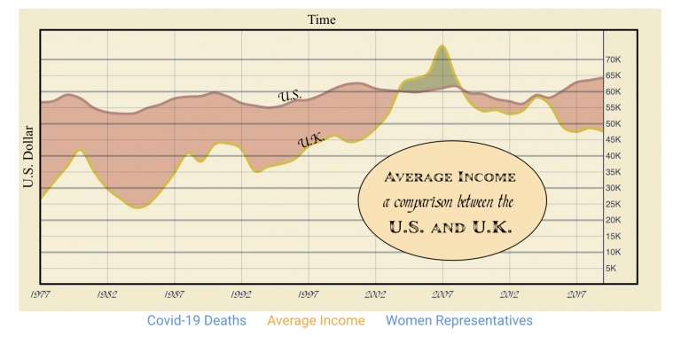
Average Income Comparison
These three charts use the same format as Playfair’s import-export chart. The d3 code is also similar. I only need to use a different dataset and modify its axis scale and title positions. The visualizations showcase an interesting comparison between U.S. and U.K. for some relevant topics.