The Digitization of Elizabeth Peabody’s Visualization Work
This project recreates digitally the visualization work of Elizabeth Peabody, a nineteenth-century writer and educator. It is informed by the questions of: “What is the story we tell about the “invention” of modern data visualization techniques? How would that story change if we looked outside the standard set of actors, and what alternate visual forms might we envision if we did?”
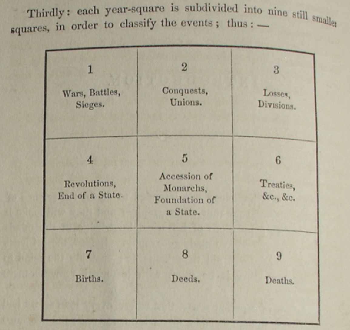
Peabody is not credited with any milestone in the history of data visualization, but her work challenges us to think about how data can be presented and interpreted through image. Her visualizations used a 10×10 grid overlaid with shapes and colors to represent historical events. Pictured is Peabody’s visualization of major events in the 1500s, and a key as to how each square in the 10×10 grid is further subdivided. Each color represents a specific country.
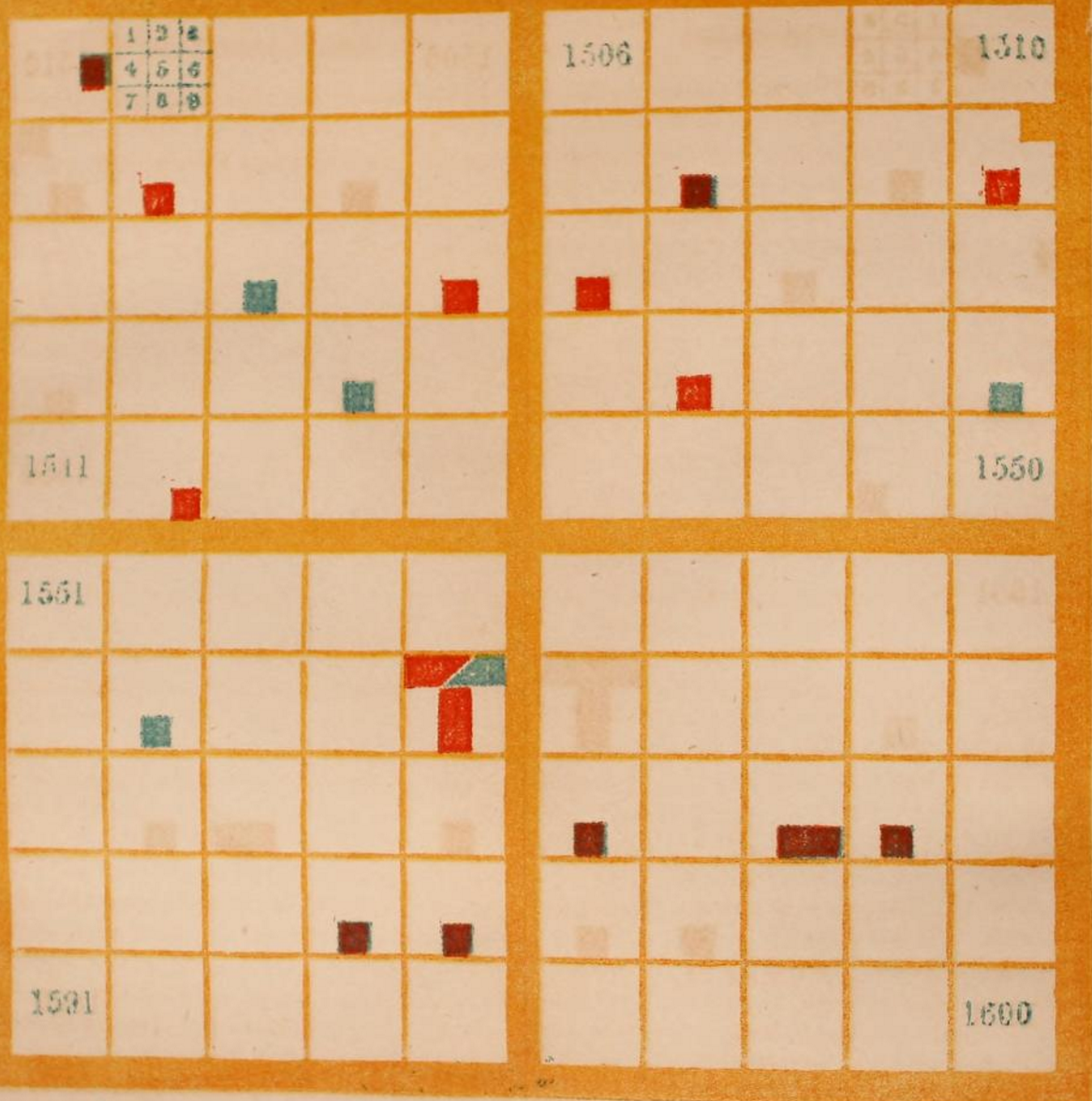
Unlike modern day data visualizations, her images were not meant to clarify the data. Her goal was to have users create these visualizations for themselves as a way of learning history. Once complete, the chart is an abstraction of the data in an entirely different form.
In recreating Peabody’s visualization digitally, we are sharing her non-traditional approaches and allowing users to participate in the creation of charts like hers. Our digital version of the project consists of three modes: view mode, build mode, and compare mode. The view mode is a digital non-interactive version of Peabody’s charts staying faithful to the original. After familiarizing oneself with the rules that govern Peabody’s visualization, the viewer can create his or her own chart in build mode. Lastly, the compare mode juxtaposes multiple possibilities of representing the data behind the visualization. In the compare mode, Peabody’s visual representation is displayed alongside two alternate visual forms: a traditional timeline of events, and a list of the elements in the html code that represent the data.
For a third alternate form of data visualization techniques, we are bringing our digital recreation to the physical world. This will consist of a physical computing interface in the form of a quilt. The quilt will have 100 squares each subdivided into a 3×3 matrix just like the digital version. The user will select a color on a separate device and then tap the squares on the quilt to trigger an LED to light up in the selected color. The result will be the abstraction of data in quilt-form.