Topics in PLMA interface
To start thinking about how we might design an interface to act with topic modeling results, it’s worth looking at existing interfaces and what they do well or don’t do well.
This interface by Andrew Goldstone allows for browsing topic models of articles from PMLA, the journal of the Modern Language Association of America. The model and code can be used for other sets of text – this is just an example.
The interface has multiple views and ways to explore the model – something can be learned from each of these. The site as a whole, and the navigation between the views, is slightly confusing and conceptually basic, but since it is described as an alpha version, I won’t dwell on those issues. The bulk of the content is in the “Overview” section.
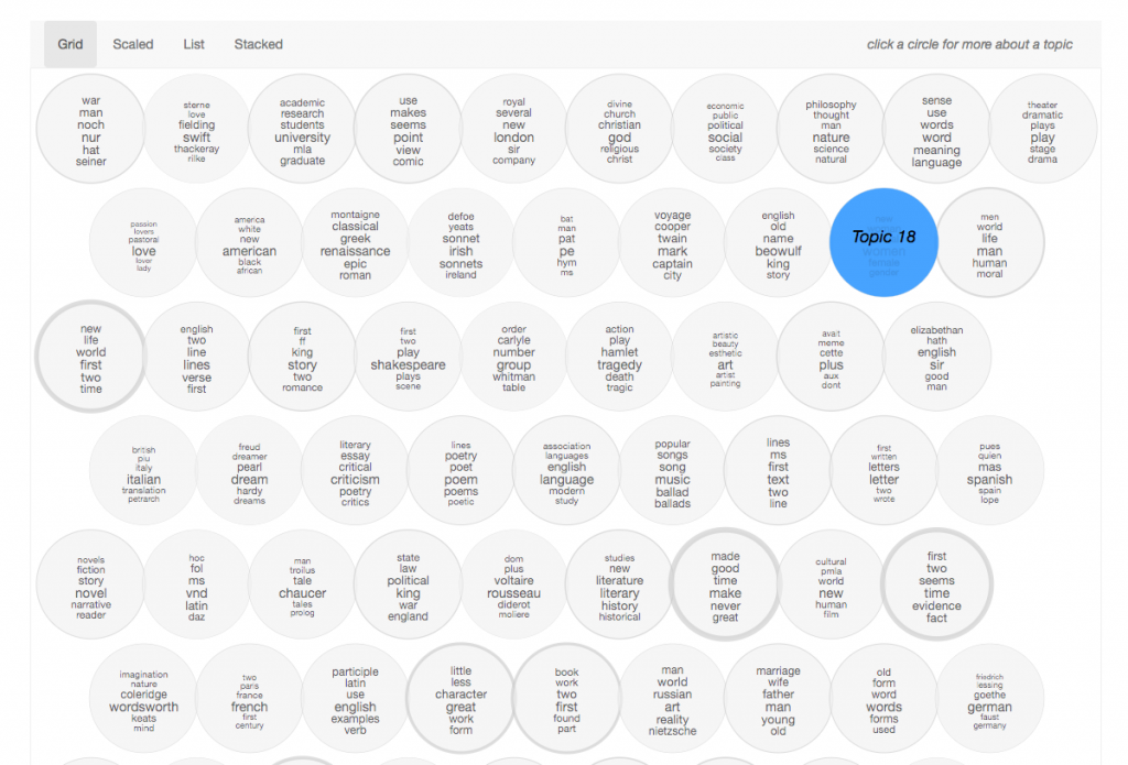
Overview: Grid
A simple display of each topic as a circle, with the words sized corresponding to its weight within the topic. The topic bubbles are arranged in order of the number of the topic. Clicking a bubble leads to the corresponding topic page, which is not part of the “Overview” section.”
Strengths:
- Easily apparent each bubble represents a topic
- Movement from overview of topics to one specific topic is clear
Limitations:
- Perhaps a technical flaw, the thickness of the border on each bubble varies but doesn’t seem to actually represent anything.
- Six words are in each bubble, however there are many more “top words” within the topic model. This may or may not be a “problem” but it is something to be aware of.
- Besides word size within each bubble, there are little other visual cues to guide the experience…which is why there are more views…
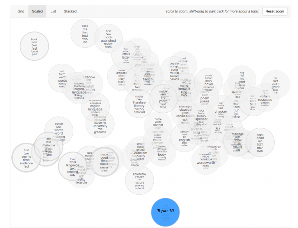
Overview: Scaled
The topics are spatially arranged by similarity. This uses principal coordinates analysis, which I mentioned in the previous blog post.
Strengths:
- Provides additional information – the similarity
- Provides interaction to discern overlapping topic bubbles
- Useful for discovery
Limitations:
- How it is arranged is not immediately clear – at least to a novice user, one less familiar with topic modeling
- Requires additional interaction to zoom in to areas with overlapping topic bubbles
- Difficult to locate topic within scale
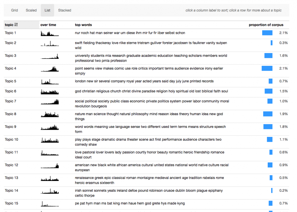
Overview: List
A table format allows for comparison of more information – adding a small “over time” illustration and proportion of words in the corpus assigned to the topic.
Strengths:
- More information viewable at once
Limitations:
- The author mentions in the documentation that the bar for the proportion of words can be misleading because “the highest-proportion topics are often the least interesting parts of the model — agglomerations of very common words without a clear thematic content.”
- The y-axes of the mini bar charts “over time” are not all the same scale
- Requires scrolling, so it can’t all be viewed at once
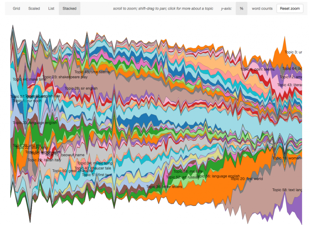
Overview: Stacked
This view evokes D3 the most – varied by color, each topic model is stacked on top of each other and shown as the appearance increases or decreases over time.
Strengths:
- Shows trends of each topic model over time, all at once
Limitations:
- Topic models with less appearances are harder to distinguish without interaction
Topic
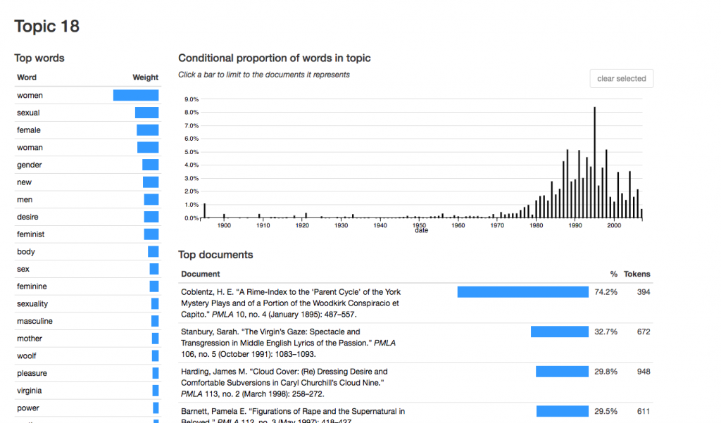
Each topic has its own view, including top words and their weight, proportion over time, and top documents.
Strengths:
- Clicking on the bar in the timeline limits documents. Great use of drilling down. Although, it would be nice to be able to select multiple at a time.
Limitations:
- Clicking on the document or the word opens up the document or word interface, leaving the context of the topic itself behind. Expansion within topic is alternative option.
Document
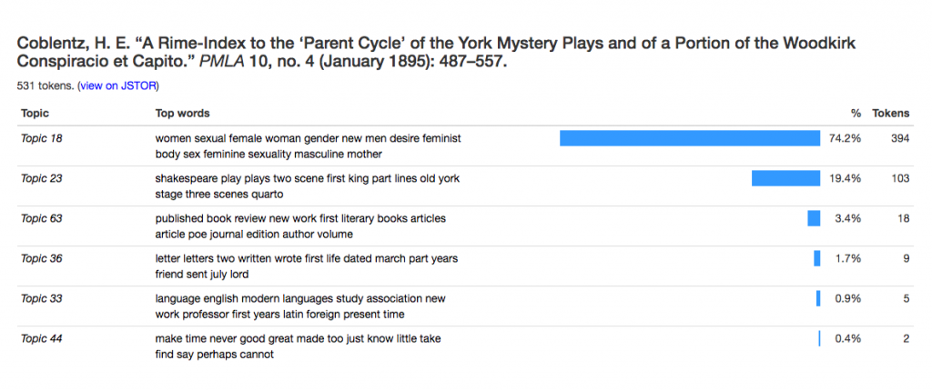
View shows title and topics by proportion. To reach a document, it must be clicked on from the bibliography page or from a topic page. If topics are the priority, this makes sense – otherwise it might be interesting to also have a document view (beyond standard bibliography).
Word
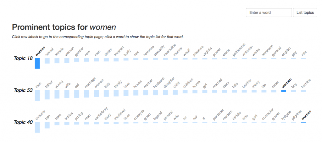
View shows topics in which the word occurs. Similarly to document, it must be reached by a list of all words (for documents, bibliography) or a topic page. If the word only appears in one topic, it’s surprising when the view changes to show a different word among many topics. The animation helps with these transitions.
General considerations
- Time to load – with a large dataset, lag time can be frustrating for the user and even make interaction impossible
- Difficult to follow a topic throughout the different views – As the screenshots that I took show, I looked at Topic 18 throughout my exploration. When on a topic page, there is no way to see the topic simultaneously in any of the Overview views. For example, I would like to return to the Overview and perhaps see Topic 18 highlighted in the Scale or Table view. However, navigating between words and documents, and discovering other topics in the document, is likely helpful to a humanities scholar.
UX Questions
From exploring this interface, I’ve come up with a list of questions to consider in future designs. Many of them are classic information visualization questions, with no one answer.
- How many words of a topic should be displayed at once to best indicate the topic? Generally, how much information should be shown at once?
- How do we design for exploration and discovery of information? Rather than a search like a database query?
- When is it appropriate to change the presentation of data, e.g. axis variables?
- When drilling down to a detail, how much context should be shown?
- How much visualization beyond the topic itself is necessary, e.g. do we also want to visualize all of the documents where each document is a variable?
- What should be sacrificed for quicker load times?
There are a lot of things to be learned from these different views. Great documentation, thought process, explanation of design decisions by author here: http://agoldst.github.io/dfr-browser/
