Repairing William Playfair at the MLA
What follows is the text of a talk about the Recreating Playfair project, delivered on a panel about care and repair at the 2016 MLA Annual Convention. Several extended publications are in the works, but in the interim, feel free to email me with any questions.
This talk describes a project that began from a seemingly simple idea: to digitally recreate some of the iconic charts of William Playfair, the eighteenth data visualization pioneer. My premise was that, by remaking these charts, I’d come to see Playfair’s designs, as well as their underlying concepts, in a new light. So this was a reparative project of the kind theorized by Steve Jackson, whose work helped title this session; and also of a kind with the historical fabrication projects that Jentery here, as well as Devin Elliot, Robert MacDougal, and William Turkel have pursued to such generative ends. But there was an additional dimension: by remaking a historical image with digital tools, I also hoped to better understand some of the tools that I use in my own DH work—and in particular, a visualization tool that I and many other DHers frequently employ: the javascript library D3.
So I recruited two Georgia Tech graduate students, Caroline Foster and Erica Pramer, to the project, and we set to work. But then what happens is what always happens: a story enters in.
So what I’ll talk about today is how this project of repairing William Playfair indeed allows us to come to see some of the main concepts associated with D3, and with visualization more generally, in a more enhanced conceptual light—the concepts of data and image, primarily, as you can see on the screen, but also ideas about error, iteration, and interaction (although I won’t have time to discuss those as much).
But I also want to try to articulate some of the features of this project that make it a digital humanities project, and more importantly, what can be gained by conceiving of it as such. Because this is the kind of project that could have been undertaken by practitioners in any number of disciplines, not to mention by any number of nerds on the internet—which, as I found it over the course of the process, turned out to be the case. But as the fields of digital humanities and design increasingly converge, it will be important to demonstrate what, precisely, our humanistic training contributes to this confluence: an attention to history, to how the past informs the present, and to how individual stories—and individual lives—bring out additional dimensions in our objects of study and methods of inquiry.
So, to begin.
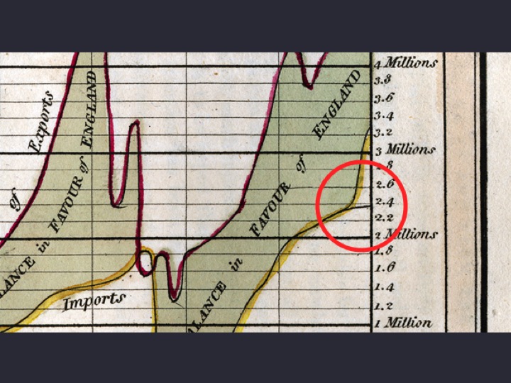
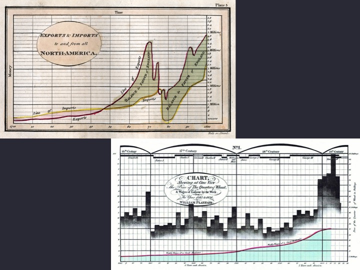 William Playfair, as I mentioned before, is widely recognized as one of the founders of modern data visualization. He’s credited with perfecting the time-series chart, and with inventing the bar chart and the pie chart out-right. Before Playfair, there had been mathematical line graphs, as well as astronomical charts. But as far as we know—with the standard caveat about the limits of the archive—Playfair was the first to abstract non-mathematical data, like the fluctuating price of wheat over time, which is what you see on the right; or the balance of trade between England and America, which is on the left; into visual form.
 Here’s a larger view of the latter, a time-series chart of imports and exports between England and America, for the period between 1700 and 1800. And you can easily perceive—and Playfair liked that you could easily perceive—the massive reversal in, and then what economists today would call the “correction” in the balance of trade between England and America for the decade leading up to, and the decade after, the Revolutionary War.
But remaking this image in D3, or, for that matter, remaking the image in any digital form, requires a different, more atomizing view. You look for the axes and their units. You look for the grid lines—some major (those are the bolded ones), and some minor. You make note of the labels. You think how you might replicate the font. You observe the colors of the data lines, of the fill between them.
One thing you don’t pay too much attention to these days, however, is the actual shape of the graph. As anyone who’s used even Microsoft Excel knows well, you plug in the data, and software takes care of the rest. In fact, when working with visualization software, you need the data before can do anything else.
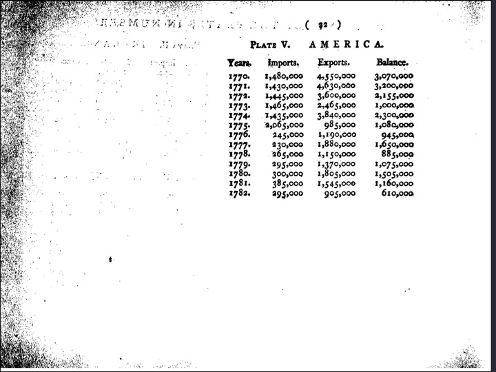 But Playfair didn’t. He engraved the data lines of his chart freehand. It wasn’t until James Watt, of steam engine fame, suggested to Playfair that he might include some data tables alongside his chart, that he did so. “Your charts,” Watt explained “now seem to rest on your own authority, and it will naturally be enquired from whence you have derived our intelligence.” So Playfair capitulated, at least for the first two editions of the book, published in 1786 and again in 1787.
But after he gained in confidence, he removed them for the third edition, published in 1801–the largest (and final) print run for the book. He understood the function of his charts as quite distinct from tables, or “figures” as he termed them, and in introduction to this edition, he explains, “The advantage proposed by this method, is not that of giving a more accurate statement than by figures, but it is to give a more simple and permanent idea.” In fact, two contemporary scholars of statistics, Howard Wainer and Ian Spence, have created updated renderings of several of Playfair’s charts in order to show how the data tables he provided do not sufficiently account for the numerous reversals in the balance of trade that Playfair depicts.
But for Playfair, this lack of data was besides the point. His goal was to model a new mode of “painting to the eye,” one that—following Locke and the dominant Enlightenment view—could be easily perceived by the senses, and subsequently processed by the mind. In other words, Playfair’s understanding of the use and significance of the image is on equal plane with, but—crucially—not connected to the use and significance of the data. The former provides a “big picture” view, one that produces knowledge through sense perception; the latter provides discrete information, the material from which knowledge is first constructed and then disseminated to a receiving and perceiving audience.
The separation between Playfair’s data and the charts he designed is no longer operational, however. D3 promotes itself as a “JavaScript library for manipulating documents based on data” (2015). Its innovation lies not in any new mode of graphical representation, but instead the ease and efficiency with which a dataset can be rendered visible, on the web, according to any conceivable visual form. There’s a lot more to be said about how, in its reliance on the Document Object Model, or DOM, which provides the organizing structure of the web, helps show how the shift from print to digital entails a more complex transformation than merely shifting from page to screen. But I don’t want to lose sight of my principal focus here: the relation between data and image.
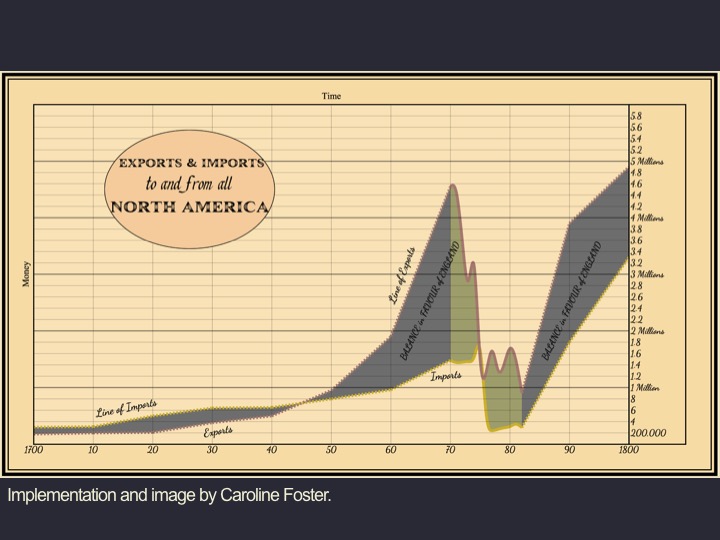 So what you see here is one version of Playfair’s chart in D3, skillfully remade by Caroline Foster, a graduate student in Human-Computer Interaction at Georgia Tech. The middle part, as you can see, replicates some of the color fills of Playfair’s original chart. But the grey areas are intended to indicate her interpolation. Reconstituting the original dataset from the tables Playfair provided in earlier volumes, we realized that the data existed in two separate tables: yearly data in one table, and decade-by-decade data—but only for the years that you see—in another. More than merely a practical issue, this structural and procedural dependency on data points to an evolving—and culturally situated—understanding of the validity of data, and of the (presumed) role of visualization in making its significance clear. Contra Lisa Gitelman, among others, who has worked to draw our attention to the inherent contradiction that the notion of “raw data” entails, this structural reliance on data enforces an understanding of the notion of data as a stable foundation from which knowledge can be drawn.
This reliance on data is not unique to D3. Almost all contemporary visualization tools and platforms require data before an image can be drawn. But in D3, the dependency goes deeper—into the structure of D3 itself. One of the tag-lines of D3 is “transformation, not representation.” So in contrast to a language like Processing, where you conceive of a virtual canvas onto which you then “draw” graphical elements through a set of standard functions, like “triangle” or “ellipse”; in D3, the designer must conceive of the ultimate image (or possible interactions with the image) as emerging from the data themselves, transforming from numerical to visual form without recourse to any virtual canvas or page. In other words, by binding the dataset to the nodes of the document-object-model, D3 bypasses the intermediary representational layer—the layer that creates paragraphs and tables and such that we associate with HTML. Instead, it operates at the level of the what is known as the scenegraph, the data structure that contains the information about the logical—as distinct from the visual—arrangement of elements on any particular web page. The result is a chart that looks like the original, but one that masks the significant shifts, technical as much as conceptual, between the eighteenth century and today.
Thus far, I have been focused on the conceptual shifts that a focus on the tools of DH making bring to light. But there are an additional set of shifts that emerge when considering the technologies that Playfair himself employed.
 So take a look at the original image one last time. And in particular, take note of the black line, on the far right, that trails off the page. What you’re seeing is an engraving error, almost certainly made by Playfair himself. Although he’s since entered the pantheon of visualization demigods, Playfair was, by his own admission, “long anxious” to be acknowledged as an innovator. More to the point, he was almost always nearly broke. So while he chose to commission one of the most skilled engravers in all of London, Samuel John Neele, to produce the plates for his Atlas, he likely requested that Neele work at speed, so as to minimize the costly detailing and other flourishes for which he was known. It’s believed that Neele engraved the charts’ decoration, framing, titles, and other lettering, leaving Playfair to engrave the lines of imports and exports by himself.
And just a bit about engraving in order to understand how this error came to be introduced: to produce a plate like the one used to print this chart, a thin copper disc is first coated with a ground: usually a layer of wax, varnish, chalk, or soot. Using a stylus, the engraver traces an outline of the design in mirror image into the ground. The temporary layer is then removed, and the engraver employs the faint impression that remains to guide the subsequent inscription process. With a metal tool called a burin–and here’s where it gets quite hard–the engraver carves the image directly into the copper plate—a process that requires significant physical strength. Playfair’s error was a common one—a slip of a tired hand—but its frequent occurrence would not have made it any more tolerable. Playfair’s result, an image inscribed into copper, when considered in the context of the time and money invested—not to mention the personal and intellectual stakes—might as well have been set in the proverbial stone.
With visualizations like the one Foster produced, as with most digital artifacts released only in final form, we don’t see the errors of their making. The trial and error happens in the implementation process, and there’s little incentive to—and for that matter, not much of a method or even a language—for exploring what these moments of breakdown might reveal. So in closing, I’ll say only that what began as a simple project, to me, has come to represent the beginning of what a richer intersection of DH and design, as both critical and creative, as both theoretical and applied, could soon become. This is a study that connects past to present, and employs the tools and techniques of the humanities–close reading, historical synthesis, and attention to the archival documents that serve as entry-points into the stories of actual lives–as a way to demonstrate how making, the conditions of making, and their consequences, are forever intertwined.