 What is the story we tell about the origins of modern data visualization? What alternate histories might emerge, what new forms might we imagine, and what new arguments might we make, if we told that story differently
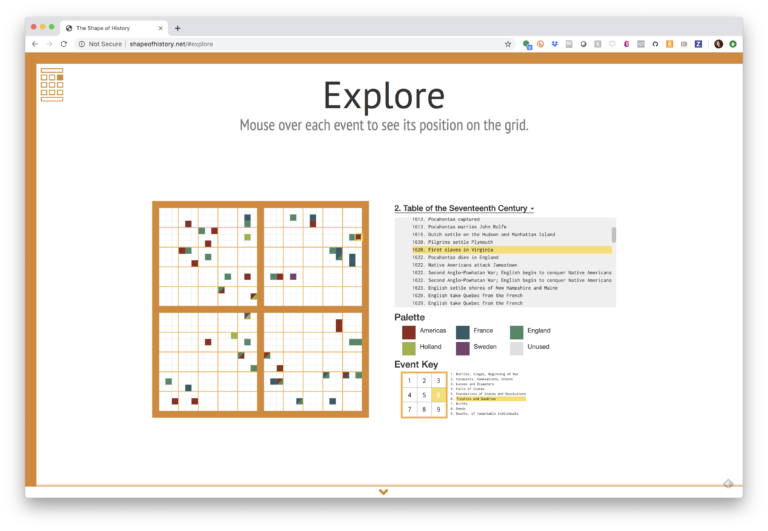
The Shape of History presents one such story, drawing from the understudied visualization work of Elizabeth Palmer Peabody. The project combines original archival research with interactive visualizations in order to demonstrate how the tools and techniques of data visualization carry very specific assumptions about how knowledge is produced and perceived.
In Spring 2017, the project team launched shapeofhistory.net, an interactive website that guides viewers through Peabody’s images and ideas.
The team is also working to recreate Peabody’s lost “floor charts” using physical computing materials. The floor charts were rug-sized versions of Peabody’s images that she designed for classroom use.
Follow the progress of this project on our research blog.
Publications related to this project include:
- Lauren Klein, Caroline Foster, Adam Hayward, Erica Pramer, and Shivani Negi. “The Shape of History: Reimagining Elizabeth Palmer Peabody’s Feminist Visualization Work.” Feminist Media Histories 3.3 (Summer 2017): 149-153.
- Caroline Foster, Adam Hayward, Slava Kucheryavykh, Angela Vujic, Maninder Japra, Shivani Negi, and Lauren Klein. “The Shape of History: Reimagining Nineteenth-Century Data Visualization.” Digital Humanities 2017. Association of Digital Humanities Organizations, 2017.
- “Floor Charts on the Floor Screen,” Medium, January 2015.
- “Visualization as Argument,” Genres of Scholarly Knowledge Production, Umea University, December 2014.
Project Contributors: Lauren Klein, Caroline Foster, Adam Hayward, Angela Vujic, Slava Kucheryavykh, Maninder Japra, Shivani Negi, Erica Pramer, Alex Beall, Courtney Allen, Noah Sutter, and Sarah Schoemann.

You must be logged in to post a comment.