InPhO Topic Explorer
This interface works in terms of visualizing a topic modeling and understanding context. However, less effort has gone into the visual and interaction design than in the last interface discussed, which makes for a steeper learning curve.
Starting Interface
The interface begins as a drop-down menu within the homepage, which also includes documentation on the code and how to download it. I already know that in our design, we’re focusing attention on the interface and exploration of the topic model results. We will probably want the documentation to be separate from the interface, like the interface in the previous blog post.
Strengths and Limitations
Two inputs: The simplicity of the starting interface is helpful. It’s clear that I need to choose a corpus of text – so I chose “Letters of Thomas Jefferson.” At first glance, it appears to require some knowledge of the documents already in the “Type to match document titles…” bar. What if I don’t know any? Clicking on the “random” button, which is also the “shuffle” button in music apps like Spotify, does nothing at first. It actually does, it just takes a little too long to load. It selects the letter “To Mr. Dumas, July 13, 1790.” I can also just click the Visualize button without any document in the bar, although this is not clear through the interface.
Visualize #: The Visualize button allows selection of 20, 40, 60, or 80 topics. I have no idea how this will affect anything, so I choose 20. It might be good to have this variation, but more indication on how it might change things for users unfamiliar with topic models might be necessary.
Main Interface
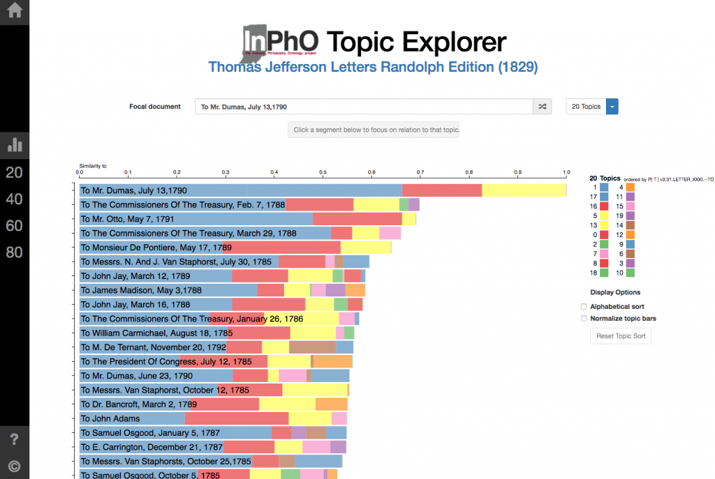
Overall, it’s nice that the primary interface is more or less on one page so there is not as much need to move around between separate views that can feel disjointed. However, there are less ways to view the topic model. The main view is a horizontal bar chart, with each bar representing a document and each section of the bar representing a topic.
Strengths and Limitations
Color: I’m not sure if this was just unlucky color assignment, but the top two topics that appear the most in the focal document were assigned the same color variable, making it nearly impossible to distinguish between the two. Typically, when visualizing categorical data (here, the categories are the topics), people can only distinguish about 8 colors – after that, it becomes much more difficult. Here, for the 20 topics, 9 colors are being used, but more than one is assigned to multiple topics, which defeats the purpose of distinguishing by color.
Connections: The interaction of hovering over the topics in the document and showing the name of the topic in the key is helpful.
Scale: Someone familiar with topic modeling might understand the “Similarity to” scale at the top, but others that are not might want a quick note of what it means.
Checkbox features: “Normalize topic bars” makes each part of the bar for the document in proportion to the collection as a whole, rather than the individual document. This is definitely a useful feature for context, and using a checkbox makes it easy. Similarly, the “Alphabetical sort” option is a useful, and simple, feature.
Topic model #: Changing the topic model quantity is helpful, using the little dropdown menu next to the dropdown menu for the focal document. The loading time is quick, a loading status bar is provided to show it is working, and then there is animation so the transition isn’t jarring. However, there is also a bar on the far left, where you can click on the same numbers (20, 40, 60, 80) and change to the topic model, but then it transitions to a blank slate. The bar on the left likely indicates a “home” or “reset” which is why this happens, but I’m not sure what it adds or what the use cases would be.
Reordering: Clicking on a segment sorts the documents by “Top Documents for Topic #”. This is useful for exploring context. However, the “focal document” then becomes lost in the reordered list. There is no highlight or visual call to attention on the document listed at the top, which is what we started with. This would probably be a useful feature to have, in order to trace a document throughout explorations of various topics.
Randomizing: Randomizing the document brings up new titles, but still requires the press of the Enter button to display the new data. Having a random button allows for playful discovery, so it’s nice to have.
Undo: The browser’s back button doesn’t always take you to the exact last place in the model viewing, so having an “undo” button of sorts would provide for handling of user mistakes or simply additional navigation.


