The Data by Design Notebook: Highlighting
From the start, we knew that Data by Design was going to have a powerful dynamic notebook feature that would not only allow the reader to take notes on a chapter, but to add any part of that chapter into their notebook. Although it may sound like a self-contained feature, the notebook functionality involves multiple subsystems:
- A highlight system (to allow the user to select text and save text, and to serialize the location of that highlight for later)
- A drag-and-drop system (to allow the user to drag their highlights and other visualizations from the chapter to the notebook, and then to rearrange their notes)
- A visualization state system (to keep track of the relationships between the visualizations and to manage the “copying” of the visualization when dragged into the notebook)
- A user authentication system (to allow the user to create an account and to store and retrieve their notebook to and from the server)
- The notebook user interface (to allow the user to add text notes and edit their notebook)
In this blog series, I’ll be describing a bit of the development process for each of those subsystems, starting in this post with the highlight system.

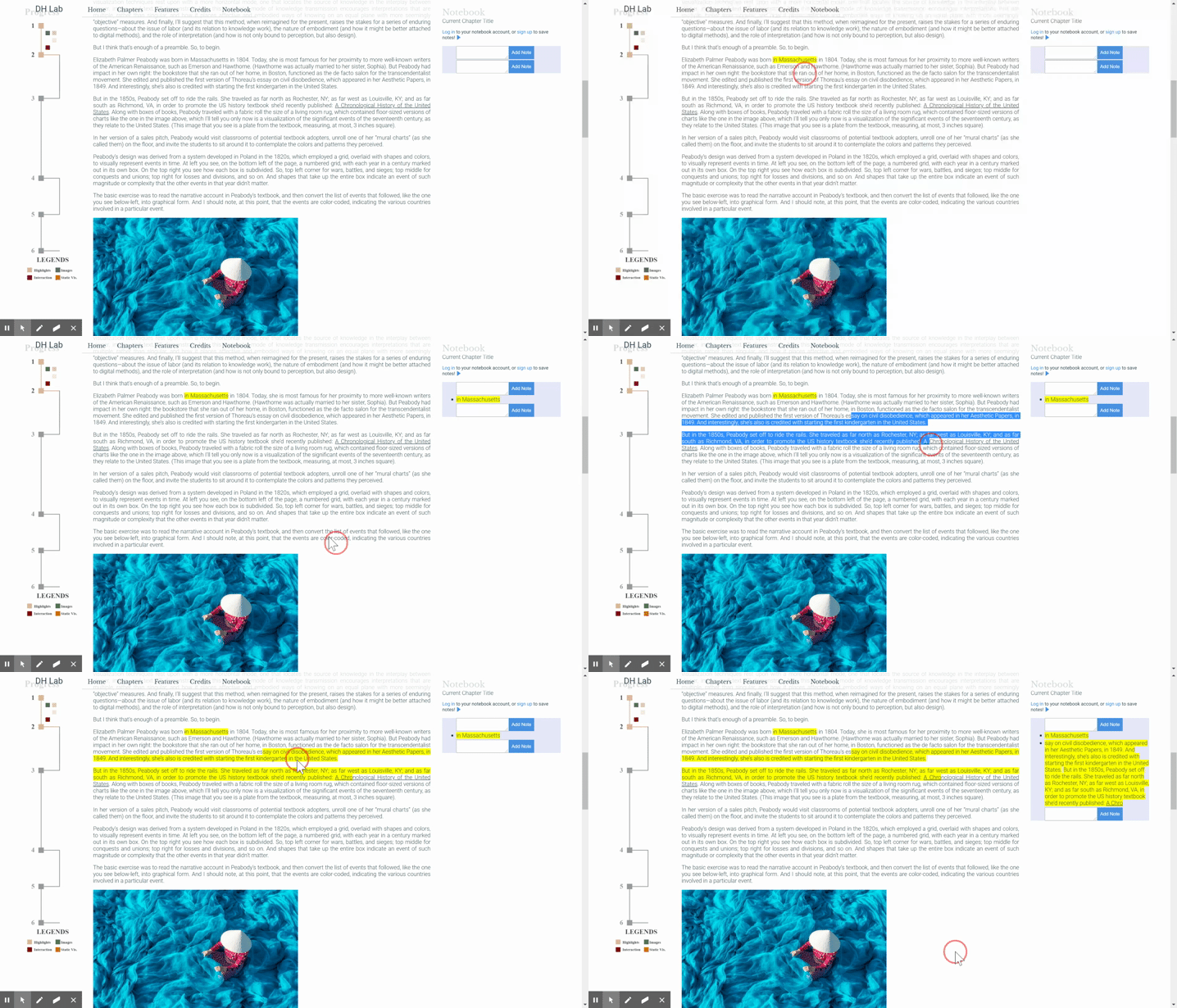
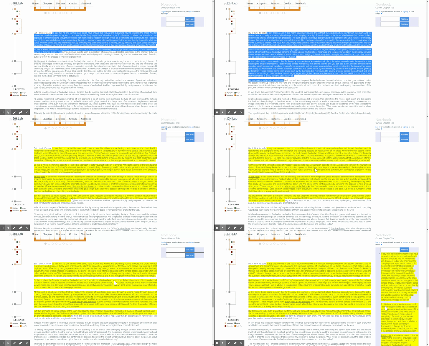
Note: The screen captures in this post use an early development version of both the chapter text and the notebook feature.
As mentioned, the goal of the highlight system is to allow the user to make visual highlights in the text. Those highlights can then be dragged into the notebook. Along with the content of the highlights, the precise location of the highlight is stored so that the user can click on the highlight in the notebook to go to its origin. Additionally, enough data must be stored about the highlight to repopulate it later, because we want to put all the highlights back in place when a user logs in.
This highlight feature was one of the most challenging and rewarding front-end features I’ve ever built. Lets dive into some of the challenges that came up along the way!
Challenge #1: It isn’t enough to just change the color
It isn’t enough to just change the color of the highlighted text; we have to treat a highlight as its own object. Imagine the following scenario: a user drags from point A to point B to create a highlight to drag that text into the notebook. Later, they drag from point B to point C. The user would expect to be able to drag this new highlight independently, but if we only kept track of the visual indication of the highlights, we wouldn’t be able to recognize it as its own highlight. The chief purpose of this highlighting functionality is to enable the user to select text and then drag that text to add it to the notebook, and it’s often the case to want to highlight two consecutive lines but comment on them separately.
While we must maintain the distinction between separate but juxtaposed highlights, we do want to allow the user to “edit” their highlight: to naturally expand a highlight by clicking and dragging outside an existing highlight to inside the highlight to select more text, or to subsume a highlight with a bigger one. In other words, we must differentiate between selections that represent a new highlight and those that represent a change to an old one.
Challenge #2: We dynamically create, remove, and consolidate elements
In web development, there is no easy way to change the styling and functionality of part of an element; generally, you create a new element that contains that part, and then manipulate that new element. In our case, when the user highlights part of a paragraph, we need to create a new span that contains what they highlight.
This can get tricky. What happens when the user selects from one paragraph into another? We can’t create a child element across two parents! Instead, we analyze the user’s selection, and if it bleeds into another block element, we create another span to place there. But since both spans belong to the highlight, and we want them to be dragged together, we must keep track of their relationship. Additionally, when the user starts in one paragraph, drags over another and into a third, we have to turn the entire middle paragraph into a span, and connect it to both the span in the previous element and the span that comes after.
Another challenge: what if the user highlights text that starts in a non-styled part of the paragraph, but ends in a styled or interactive one, like a link? We must make sure that the new highlight span keeps the styles and attributes of the correct portion of the highlighted text.
Luckily, the browser provides the Range API, which helps extract the contents of a user’s highlight, even when it starts and stops in incongruous positions. By analyzing, manipulating, and reinjecting those elements, I was able to create a consistent solution.
Challenge #3: Serialization
When the user logs in, we want to populate the page with their previous highlights. To enable this, I had to find a way to represent a highlight as a string that we could save and load from the server. Once I built the procedure to turn a selection range into a highlight, I could use that to repopulate the highlights as long as I could save that selection range—a start position and end position on the page—to the server. What this essentially amounts to is taking an element and generating a unique selector string than can be saved and used to find that element.
It turns out that generating concise selector strings is not a trivial problem, with dozens of solutions and libraries existing online. Since I joined the team, one of our goals for Data by Design has been to keep the number of dependencies low, and most of these libraries would be various degrees of overkill: while these selector-generation libraries create efficient general-use CSS selection strings compatible with built-in functions, I didn’t care about the format of the strings, since I was going to use my own deserialization function.
Ultimately, I opted for a simple solution that stores the path from the closest ancestor with an id—given that our element ids are unique—as well as the offset within that element. This solution might struggle if we expect the chapters to change after publication, but we can make the system more resilient to structural changes by adding ids to every low-level paragraph. (A system resilient to textual changes could save the actual HTML of the highlight and do a best fit when repopulating.)
Challenge #4: Grouping and Dragging
As mentioned earlier, multiple highlight span elements may make up a given highlight. That means that the user should be able to start dragging from any of them and expect that the whole group will come along. We thus need to store the relationship between the elements. (Recall the AB, BC example: we that we can’t simply check the DOM to see if there’s a highlight span directly after the dragged one, as that span might be part of a different highlight sequence.)

One way to do this is to make the Highlightable mixin (the object that handles all of this highlight creation logic) stateful: storing a reference to each highlight span, keeping track of their relationships, and providing lookup functionality to grab a highlight span’s buddies. I felt that the simpler solution was to put a little bit of state on the span elements themselves; namely, to add “overflow-next” and “overflow-prev” classes to signify when an element comes with a friend. Then, no matter the starting point, the drag event handler traverses and collects the elements. More on the drag-and-drop sequence in the next blog post!
Challenge #5: Non-highlightable elements
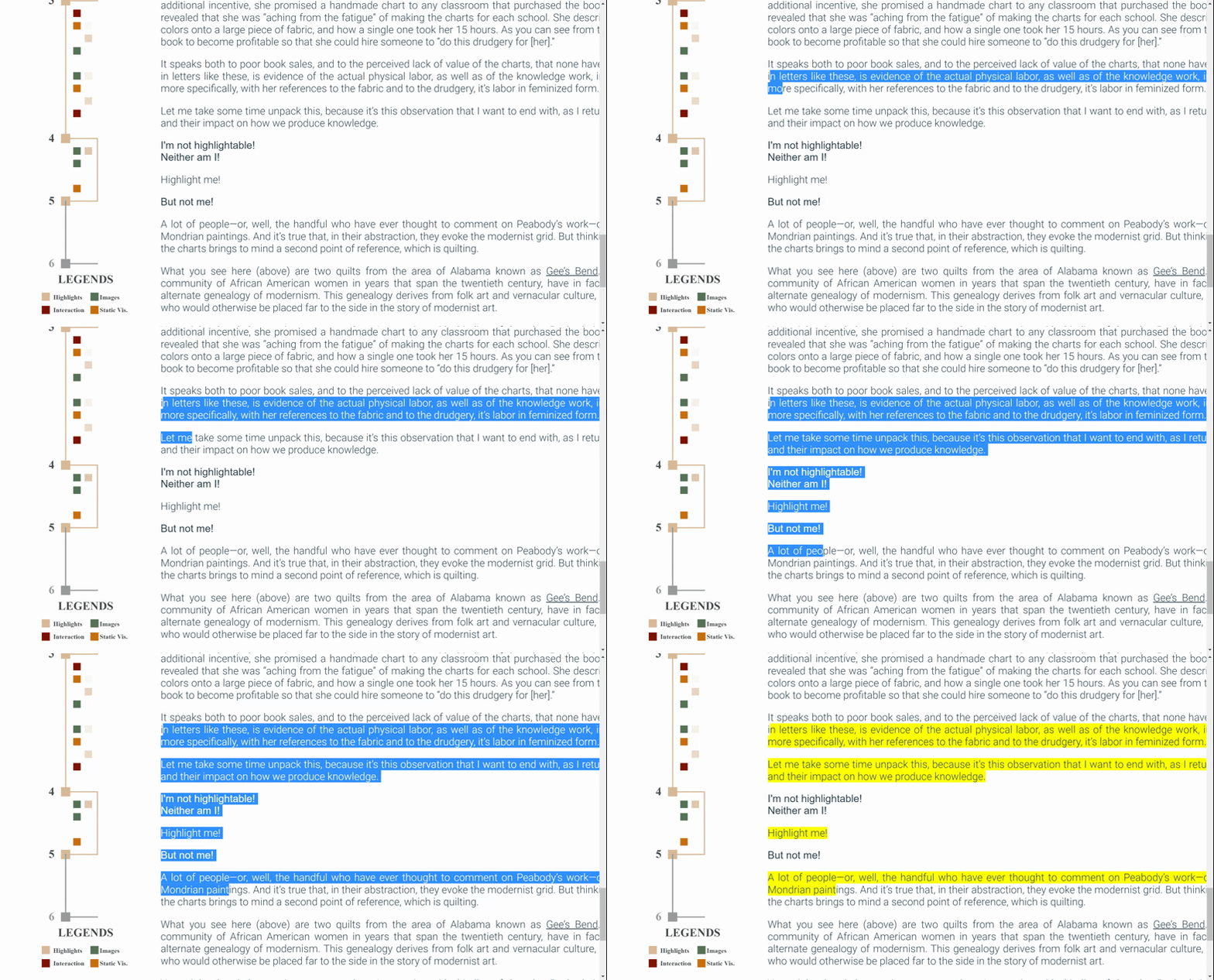
I saved the hardest for last. The multimedia chapters of Data by Design have more than just text; embedded images and interactive components can be dragged into the notebook, but it doesn’t make sense to make them highlightable in the same way that text is. Given that, what should the highlighting experience be like when the user encounters these elements? To maintain a non-obtrusive experience, I allow the user to select over these elements, but when they let go of the drag, any element that is not highlightable will not be highlighted.

This involves an array of allowed “highlightable” block element types (which can be configured by each chapter), as well as functionality to examine an element’s closest block parent. One of my first attempts involved removing the entire selection from the DOM and returning each of its block children to the DOM as either unchanged or as a highlight span element. However, my best solution involved figuring out the highlightable portions and only extracting and modifying those.
After the user finishes selecting, we break down the range into an array of smaller, highlightable subranges. That array is iterated, creating highlightable elements; the non-highlightable components aren’t added to this array and are left untouched.
That’s it for the highlight feature! While it’s tailor-made for Data by Design, it provides a feature that I think a lot of digital humanities projects could benefit from. I wrote (and rewrote and rewrote) more code for this feature than for any other part of this project, and I learned a lot about the ins-and-outs of the DOM and some of its less well-known APIs. As an undergrad, it felt amazing to be entrusted with a problem as complex is this one, and I’m proud of what I came up with.
[…] my last post, I introduced Data by Design’s notebook feature, and spoke a bit about the design and […]