The Data by Design Notebook: Drag and Drop
In my last post, I introduced Data by Design’s notebook feature, and spoke a bit about the design and implementation of the chapter highlighting capability. Highlighting, though, is only the first step in this user story, and we wanted a drag-and-drop interface that felt simple and natural to move highlights to the notebook. In this post, I want to outline how I integrated drag-and-drop throughout DxD’s UI.
Why Drag and Drop?
Although we all intuitively felt that we wanted drag-and-drop for this interface, I want to parse that here. Why does drag and drop feel natural and appropriate? When does it not? How do we make the experience as intuitive as possible?
At a basic level, drag-and-drop is intuitive because it maximizes the correlation between interaction and representation. At each moment in the drag, the user is given the immediate feedback of what their completed action would mean. Drag-and-drop interfaces are everywhere, so let’s illustrate with an example.
The Chrome tab system allows the user to freely reposition tabs using drag-and-drop. As the user drags, the view is instantly updated to reflect the new tab position, whether or not the user ultimately chooses that position. This reduces cognitive load, as the user doesn’t have to imagine anything: What You See is What You Get. This complete visual correlation between interaction and result also allows the user to make use of the representation to help make their decision. They can drag a tab back and forth and the tab flow updates automatically, allowing the user to test out different positionings.
To use terms from Don Norman’s design vocabulary, great drag-and-drop controls maximize mapping: the interface creates an effective correlation between interaction and result, reducing the need to learn or remember anything new. It’s important, then, to make clear exactly what will happen when the user completes the drag, to give them feedback along the way: in the browser tab example, feedback takes the form of the surrounding tabs’ movement.
Drag-and-drop interfaces don’t rely on on-screen controls, like buttons, drop-downs or textboxes. This is their strength, as it allows drag-and-drop to be as intuitive as point-and-click and turn-to-steer. But it can also present a problem: how does the user know that something is draggable? The chrome tabs change color on hover, but this signifier is rather abstract: it isn’t obvious that “brighter color” means “draggable,” and a user might not ever try. And so the first test for whether drag-and-drop is appropriate for a given interface is the question, “would I assume I might be able to drag it?”
It’s these things that I think about as I design and build the drag-and-drop notebook: creating an obvious mapping, giving appropriate feedback during the drag, and signifying that the drag is an option. It’s certainly a work-in-progress, as any initial, pre-user-research design must be, but it afforded my first foray into drag-and-drop on the web.
The Drag and Drop API
Before implementing anything, I had to learn the Web API for drag-and-drop. This essentially amounted to some articles on MDN, but it really isn’t the most intuitive API. I want to summarize the basic process in hopes that a step-by-step breakdown might be of use to someone, not the least to my future self!
Step 1: The draggable attribute
On your draggable element, you must setdraggable="true". If you don’t, it won’t register your drag events. (By the way, you can set draggable="false" to turn off the browser’s default dragging functionality for that element, which normally allows the user to drag text, images, and links around and into other programs.)
Step 2: The dragstart event
When the user begins to drag the element, it will trigger any registered dragstart event. Within that event, you set the parameters of the drag, which include:
- the drag image (the ghosted image that shows up to represent the element during the drag). You set this with
event.dataTransfer.setDragImage(someElement, xOffset, yOffset). - the drag data, which is a series of labeled pieces of data. You attach these pieces of data to the event using
event.dataTransfer.setData(key, data). This data then gets passed through to theevent.dataTransferobject on the drop event—we’ll get to that.- In the examples on the docs,
keyis always a kind of data type, like “text/plain”. In practice, it’s simply a key for the data, and you can choose anything. - You can only send strings as that data. If you do need to send a full object, you can stringify it or send each property as its own
setDatacall.
- In the examples on the docs,
Step 3: The dragenter and dragover events
Yep, there are two of these that you need to keep straight. Registering dragenter on an element will trigger that event when a drag enters the bounds of the element, while dragover triggers as long as the user is dragging within that element, and it will trigger repeatedly during that time. (If you want to trigger an event as long as the user drags a draggable element anywhere, you can use the drag event on the draggable element. These latter two events sounded pretty useless to me, but perhaps they can come in handy if you want reactions on precise locations within your drop elements.)
Here’s where the docs get confusing. According to this, you need to register and cancel both the dragenter and dragover events to designate an element as a drop target; according to this, you only need dragover (along with the drop event). I’ve been able to make things work using just the dragover event, but I add and cancel dragenter just to make sure: maybe it’s a documentation mistake, or maybe it’s platform-specific gotcha.
What do I mean by “cancel”? In order for the drop to register, you have to cancel the event by calling event.preventDefault() within the event listeners. In our case, I fulfill this by having a bunch of mostly-empty event listeners that just call event.preventDefault(), but you could use control statements to only call event.preventDefault() when a condition on the drag element or the drag data (both of which you can access through the listener’s event argument) are met.
You can also supposedly set the event’s drop effect within these listeners, which is supposed to give visual feedback by changing the cursor based on three available types of drag actions, but frankly I haven’t gotten it to work, and I find it easier to change the cursor by manipulating CSS. For now, I’m happy with the default:
Step 4: The drop event
They saved the most straightforward for last. Register a drop event listener on the target element and it will be called when the user has dropped the drag element on the target element. Within this listener you can access the data we set earlier by calling event.dataTransfer.getData(key). You can get an array of all the set keys with event.dataTransfer.types.
The docs tell you to call event.preventDefault() at the end of the event so it won’t call the browser’s default drop handler; I haven’t had an issue with this, but I can only assume it’s a good idea. I also call event.stopPropagation() on a parent so as not to trigger the drop event on its children.
There’s also a dragendevent called on the dragging element, but I’d suggest to keep all of your drop handling in one place.
Signifiers and Feedback: It shouldn’t be a drag to drag
Terrible pun aside, let’s talk about the basic visual feedback in this initial design, and how I applied the API with design principles in mind.
To signify that a highlight is draggable, I’ve set the cursor to grab:
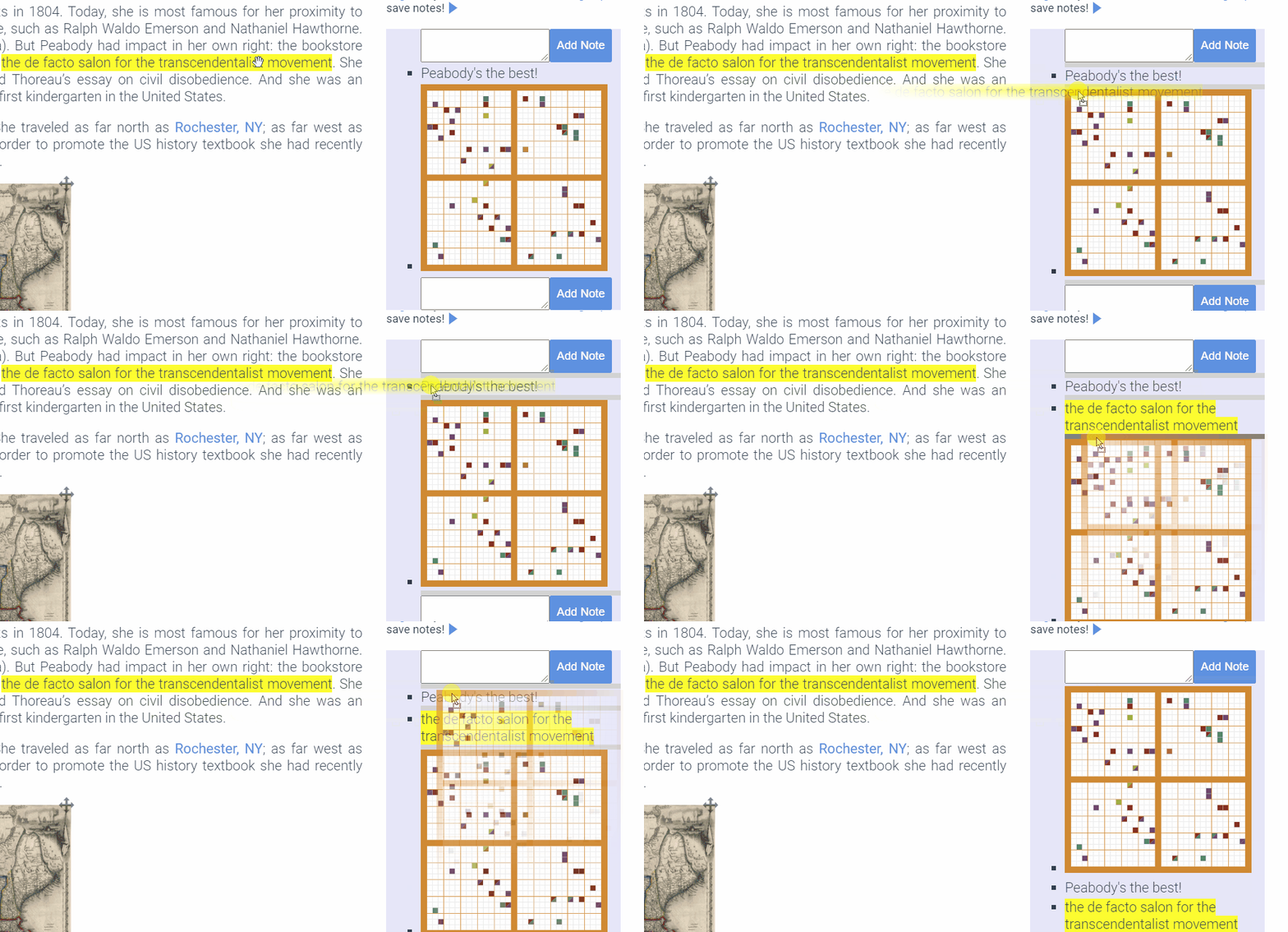
For highlights that span more than one paragraph, I dynamically generate a drag image that contains all of the dragging elements, rather than just the one the user clicked on, to accurately represent what data is being transferred.

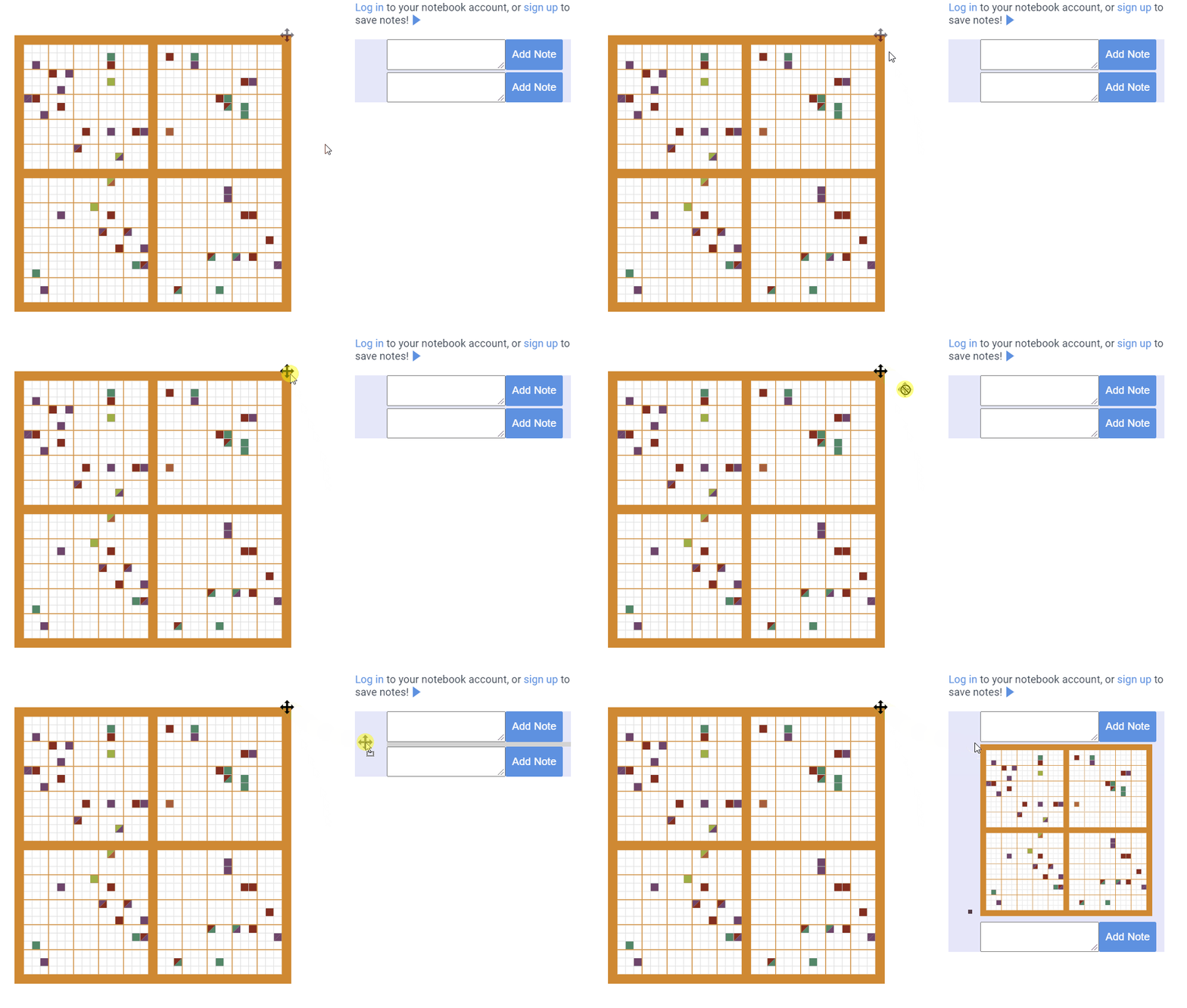
As for visualizations, in this design they all have this little dragger in the corner, which serves both as an indicator and as a handle for the drag. (We don’t want to make visualizations draggable from anywhere, as many of them have internal mouse events.)

As you can see in this gif, the entire notebook is registered as a drop handler; by default, it puts what you dragged at the bottom of the notebook. But there are also individual drop handlers before and after each node in the notebook. As you drag over one, it changes color, indicating your target position:
As I’m writing this, I’m still not sure whether these indicators are tall enough, and it might be better not to necessitate dragging on to them at all, and have a “snap” feature when you’re close enough. It’s a continual process of tweaking, based on my own experience using the design and that of my teammates and, eventually, our target users. For me, it isn’t tedious: it’s part of what makes web development dynamic and enjoyable.