Data by Design: Static Visualizations for Playfair’s Chapter
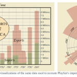
Besides the “Export and Import to and from all North-America” scrollytelling visualization, I also created several static visualizations using d3 to showcase Playfair’s method with modern technologies. The first two visualizations use the same data of Playfair’s import-export chart. The…
Data by Design: Playfair Visualization, Step by Step
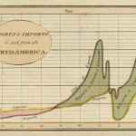
In Playfair’s chapter, we remade his original “Imports and Exports to and from North-America” graph with d3. We also breakdown his process of making visualizations with engraving and compared it to the modern way of using software tools. The recreation…

Data by Design: Front Page Timeline
On the front page, we decided to implement a timeline below the main title to give our readers an overview of all the visualizations we will be covering in the book. The timeline consists of three main parts, the gray…
Data by Design Chapter Navline Implementation
I’ve been working on the implementation of the chapter navigation line. Here are some features listed: Blocks/Nodes with different colors represent different types of visualization, where their position in the navline is determined by their position in the chapter. The…
You must be logged in to post a comment.