Data by Design: Front Page Timeline
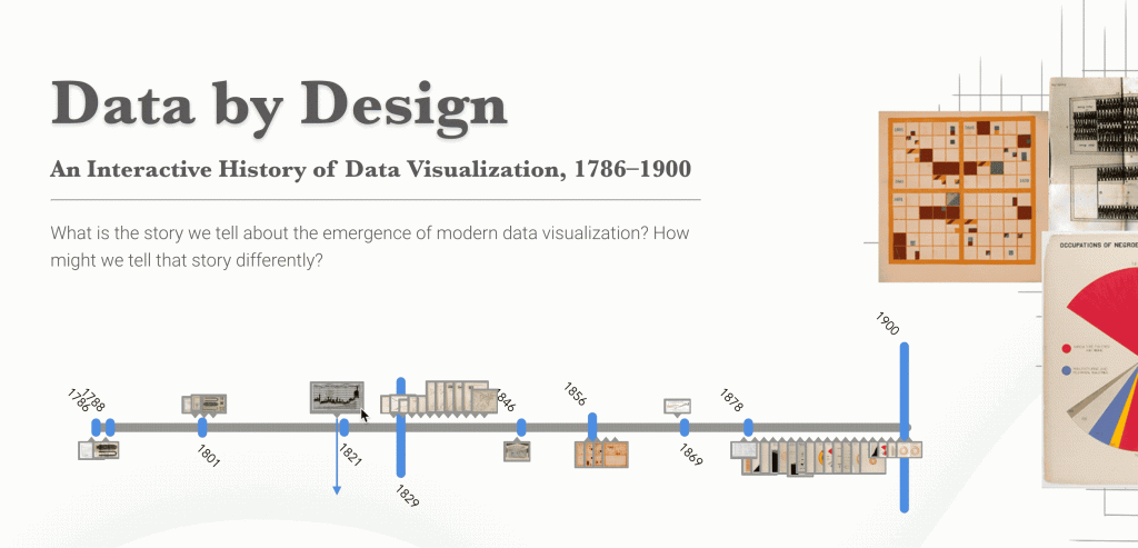
On the front page, we decided to implement a timeline below the main title to give our readers an overview of all the visualizations we will be covering in the book. The timeline consists of three main parts, the gray horizontal bar representing time from the year 1786 to the year 1900, multiple blue vertical bars at each time mark representing the number of visualization we collected for that specific year, and the image frames that showcase the thumbnails of those visualizations.

The image information is stored in the points array in the data function of the Vue component. The structure of each data point is shown in the screenshot below.

Each data point has a unique id, the year it belongs to, the order of that year, the link to the location of the image stored, and the image’s width and height. These information is used to calculate the position and size of the image frame. The structure should also be optimized and stored as a JSON or CSV in the future.
The timeline is implemented in the Picline Vue component, takes in the points array from the home page. The timeline is made purely through SVG. We first have a function to group the data points by year and determine the height of the blue bar, then draw the blue bars and the corresponding text, the position of text alternates by odd and even. We then iterate through all the data points to draw image frames. The position of the frame is determined by the position of the year plus the offset of the order of the point in the year.
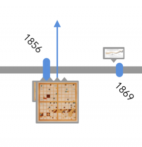
We added @mouseon and @mouseleave to the function to observe users’ interaction. When hovering over each frame, the frame size and the picture size will be enlarged by two, displaying on the top layer with a blue arrow pointing the position on in gray line.

The entire timeline would work as the gif showed below.
