Data by Design: Playfair Visualization, Step by Step
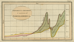
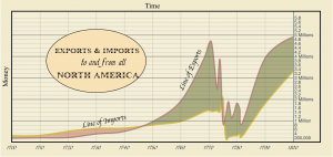
In Playfair’s chapter, we remade his original “Imports and Exports to and from North-America” graph with d3. We also breakdown his process of making visualizations with engraving and compared it to the modern way of using software tools.

Playfair’s original visualization

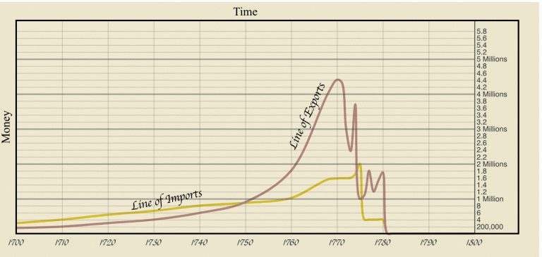
D3 recreation of Playfair’s visualization
The recreation integrated the scrolly-telling feature we had for this project, breaking down the process of Playfair’s engraving and transformed it into today’s data plotting method with d3. As the reader scroll through the web page, components of the visualization appears in the order of creation along with text explanation.
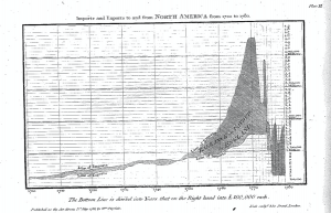
The visualization starts with borders, axis, and labels. The first version of the impart and export line corresponding to Playfair’s first draft.

Playfair’s First Draft
Next, the lines transformed into Playfair’s final version and then today’s recreation. The lines of Playfair’s versions were crafted by tracing the original visualizations in Adobe Illustrator and exporting them into SVG format. After carefully position the SVG lines into the d3 visualization, I then have to manually match the line with data points in the CSV used for the recreation in order to implement the transforming part.

Line Transformation GIF
The visualization then displays the title and also the datapoint used to form the curves in the version of creation. We can see that the curve of the reaction was generated by those data points so that there is a perfect match between them, whereas Playfair’s original versions would resulting in some error.